Why the Same Book Cover Looks Different on Amazon and IngramSpark?
- Nada Orlic

- Feb 9
- 4 min read
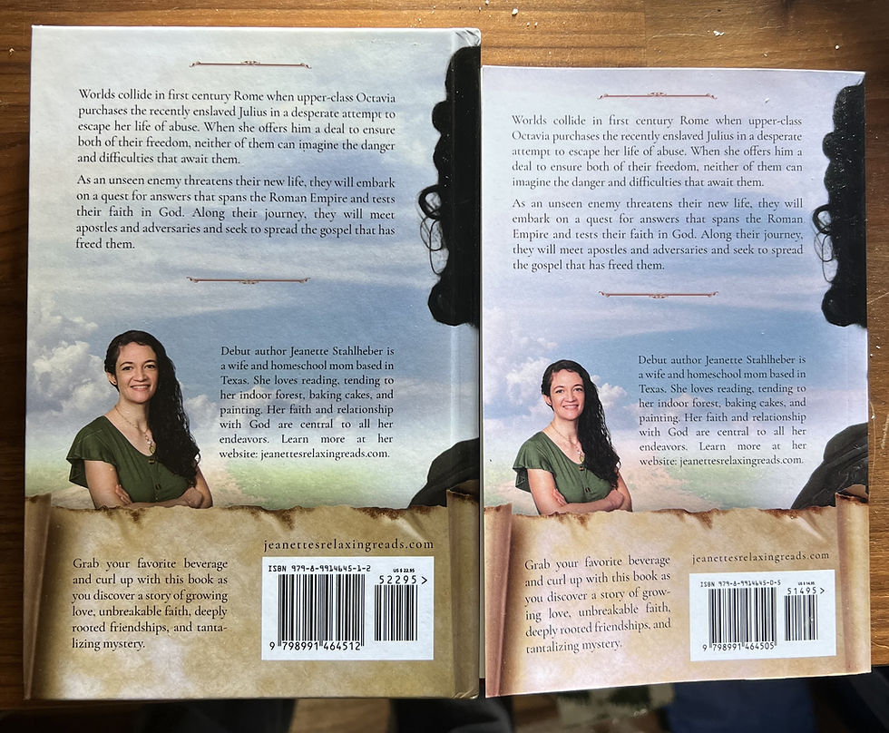
Imagine the scene: an enthusiastic author holds two freshly printed copies of their book, one from Amazon KDP and the other from IngramSpark. Placing them side by side under the warm lighting of their living room, they can't help but notice the subtle yet distinct color differences. Though both books have the exact same cover design, the paperback's hues appear slightly warmer than the hardcover's cooler tones. This often becomes most noticeable when comparing paperback and hardcover editions side by side.
These differences are not caused by errors in the artwork or by uploading the wrong file. They are a result of how print-on-demand production works. Unlike traditional offset printing, where large quantities of books are printed in a single run, print-on-demand allows for smaller quantities to be produced as needed, which can lead to variations when different materials and finishing methods are involved.
Paperback vs Hardcover: Why Colors Shift
Paperback covers are printed on flexible paper stock. Imagine the ink as you would see coffee soaking into a paper napkin—it sinks into the surface in a relatively predictable way. This absorption usually results in colors that feel warmer and closer to what you see on screen.
Hardcover books are constructed differently. The cover is printed, laminated, and then wrapped around a rigid board. That board, combined with the lamination film, changes how light reflects off the surface. Think of it like comparing glossy photo paper to a matte postcard. The glossy finish of photo paper reflects light, making colors appear cooler and more vibrant, whereas the matte finish of a postcard absorbs more light, resulting in a warmer appearance. As a result, some colors, especially blues, teals, purples, and subtle gradients, can appear cooler or slightly shifted compared to the paperback.
This is why elements like wings, tails, small stars, or glowing accents often show differences first. These areas rely on delicate color balance, and even a small change in reflection can alter how the color is perceived.
Amazon KDP vs IngramSpark Printing Explained
Amazon KDP and IngramSpark operate separate global print networks. They use different machines, calibration standards, paper suppliers, and lamination films. Even when both platforms produce high-quality results, they do not produce identical results. However, using both networks can still be advantageous, as it expands distribution reach and provides a strategic advantage for authors aiming to tap into a wider audience. The differences in production can thus be viewed as a trade-off for broader access and potential market benefits.
Hardcovers are especially sensitive to this because they involve more production steps than paperbacks. Each step introduces a small variable. When those variables stack, the final printed color can shift slightly, even though the digital file is unchanged.
This is normal behavior in professional printing and is widely experienced by authors publishing across multiple platforms.
What Print on Demand Means for Book Cover Color
Book covers are prepared in CMYK color space, which is required for print. CMYK itself is already a translation from screen-based RGB color, similar to transposing a song from one key to another. Just as some notes sound different in a new key, not all colors convert perfectly from RGB to CMYK.
Even with a correctly prepared CMYK file, the printer still interprets that data through its own system. Ink density, dot gain, paper brightness, and lamination type all influence the final appearance.
This is why two printers can produce two valid but slightly different versions of the same cover.
Is this caused by low ink or printer problems?
In professional print-on-demand environments, this is not the same as a home printer running out of ink. Books are not printed with cartridges that are visibly depleted.
However, digital presses do experience normal operational variation. Calibration state, machine wear, environmental conditions, and maintenance cycles can all affect color output slightly. These variations are usually subtle, but they can be noticeable in darker or cooler color palettes.
That said, most visible differences between paperback and hardcover, or between Amazon and IngramSpark, are due to materials and finishing, not to mistakes or poor quality control.
This chart compares the main production factors that influence cover color when the same book is printed through Amazon KDP versus IngramSpark. It focuses on the practical differences that can cause a paperback and hardcover to look slightly different, or for the same cover file to print with a cooler or warmer tint depending on the platform. The goal is to show that these shifts are usually caused by materials and finishing, such as paper type, lamination, case board for hardcovers, and normal print-on-demand variation across manufacturing locations, not by a mistake in the design file.
What Authors Should Expect from POD Printing
If you publish the same book as a paperback on Amazon and as a hardcover through IngramSpark, you should expect minor visual differences. These differences are usually most visible in:
Blue and teal tones
Metallic or glowing accents
Fine gradients and atmospheric effects
Dark, moody color palettes
To proactively manage these differences and assure yourself of the final product, consider ordering both formats simultaneously. Conducting a "side-by-side sanity check" under normal reading conditions will help visualize the expected variations and establish a benchmark for quality. This is not a failure of the design or the printer. It is a natural outcome of modern print-on-demand production.


The practical takeaway
When evaluating printed copies, it is important to compare them in normal reading light and to understand that print-on-demand is a manufacturing process, not a perfect replication of a digital preview.
Small differences between platforms are expected. The goal is not absolute uniformity, but a high-quality, professional result that translates well across formats.


Comments